
[ad_1]
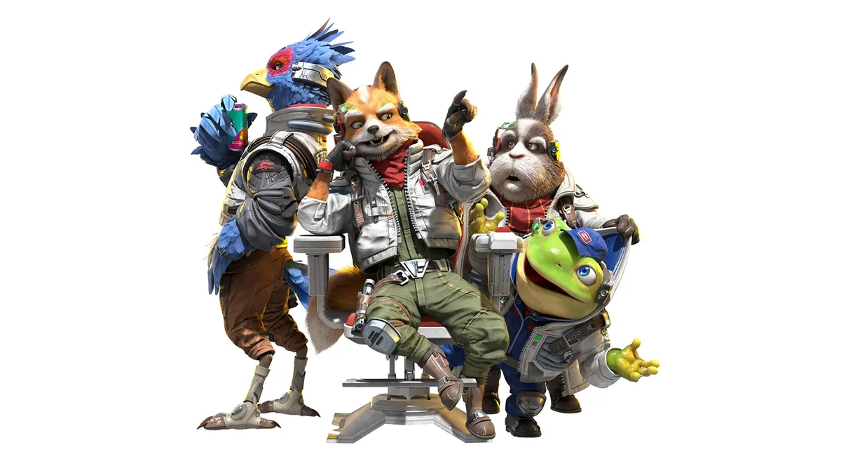
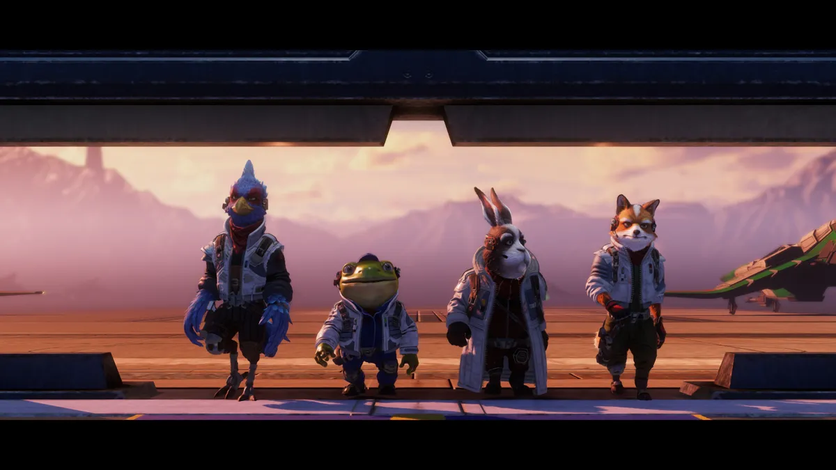
The reaction to Nintendo’s new Star Fox 64 remake on Switch 2 says a lot about the risks of redesigning classic characters, because despite the improved graphics, better lighting and more detailed models, many fans think Fox McCloud and the gang have lost some of their charm in the recently revealed remake.
One of the biggest lessons character designers can learn from the best retro games is that silhouette matters, perhaps more than detail. What stands out and needs to be remembered from old games, like Star Fox or indeed Super Mario, are the bold shapes, oversized expressions and confident weirdness that made those characters instantly recognisable. Modern remakes often chase realism first, but realism can flatten personality surprisingly quickly and remove the quirks that made the characters appealing in the first place.
Game artists working on designs in the ‘90s and 2000s needed to focus on exaggerated features because stylisation was a means of overcoming technical limitations. The hardware of the ’80s and ’90s forced artists to prioritise readability, bold colours, and graphic shapes that worked on blurry CRT screens, and those constraints accidentally created an identity, and it’s that style we remember and love.
Modern tools remove those limits, but they also create the temptation to overdesign and add more detail, particularly as more remakes use Unreal Engine 5, and it’s why every time a classic character gets updated, fans raise eyebrows. It happened with Donkey Kong and will continue to happen. Everything can now have realistic fur, cinematic lighting, and film-quality materials – or even a modern need to be more anatomically correct, so we get realistic chicken legs and small fox feet – and sometimes all that polish sands away the awkward little details people were emotionally connected to in the first place.
That’s probably the useful takeaway from the Star Fox debate. When redesigning classic characters, don’t just update details; consider the emotional connection fans have to a design and which aspects of that design need to remain and speak louder than realism. Protect the charm that lives in the exaggerated bits, the strange proportions, the imperfections, designers are most tempted to ‘fix’ first.
Retro redesign tips and ideas
We have some good advice on character design to follow and tips for creating dynamic character designs, but here are some nuggets of advice gleamed from past interviews I’ve had with concept artists, applied to redesigning fan-favourite characters.
- Preserve silhouette before detail: a character’s recognisable shape is more important than realism, especially with retro designs where fans remember outlines and poses more than material accuracy.
- Don’t over-explain stylisation: older character designs often worked because proportions, expressions or features were exaggerated and slightly abstract, making everything anatomically correct can flatten personality.
- Constraints create identity: limited hardware forced bold colour palettes, graphic shapes, and readable facial features, so we consciously keep visual clarity and exaggeration rather than drifting toward generic realism.
- Charm often lives in imperfections: cleaning details like exaggerated eyes and strange proportions that became emotional hooks for fans, risks robbing the designs of the personality fans fell in love with.
- Update emotional readability, not just details: when redesigning classic characters, ask what players were originally emotionally connected to, such as attitude, expression, colour, and silhouette.
[ad_2]
Source link